WHY PANGOLINS DREAM OF QUICHE
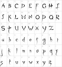
no, not "do androids dream of electric sheep" or "green ideas sleep furiously" - or even "the quick brown fox jumps over the lazy dog" - but a sentence that uses most of the letters needed for typeface identification. . .
(a typeface using Roman characters, obviously)
I love typeface
I find it fascinating
when I was paid to write and think (yeah, I know - gobsmacking, eh), one of my roles included responsibility for commissioning corporate design
once I had to commission new typefaces (but not a new "logo", thank goodness) (it was the same company that recently came up with the "logo" for promoting 2012, g*d help us) - a serif and a sans serif font for use (only according to the manual tho) by the very large and successful company which paid me to think and write
the designers weren't asked to come up with a totally new typeface, but to suggest which two fonts out of the myriads available, should be exclusively used (according to the manual) throughout the company. . .
the idea was that if everyone who was responsible for producing written communications used only either or both of the same two typefaces and no other (in accordance with the manual), the communications from the company would seem more "cohesive"
*raises eyebrows*
*gazes up to the ceiling*
*shrugs*, *hums*, *whistles*
and also
- all these years later -
* shirks all responsibilty for "The Manual"*
*gazes up to the ceiling*
*shrugs*, *hums*, *whistles*
and also
- all these years later -
* shirks all responsibilty for "The Manual"*
.
(anyone who ever had to produce or use a corporate identity manual will know exactly what I'm referring to)
this project involved many trips to the design company's offices, a short walk from the office where I worked
the best thing about a trip to the designers was the lunch in their canteen
and the second best thing was the door to one of the presentation rooms, which was hinged not at the edge but two thirds of the way across the span - the door was fashioned from a slice thru a wooden aeroplane wing and was the most beautiful oval shape and moved in a very sultry fashion (for a door)
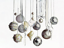
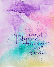
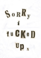
anyhow, the inspiration for these thoughts and reminiscences (that noone is paying me for in £ or $ terms, but which earn me unmeasurable quantities of pleasure and joy by being able to share them with you) came from here
(via the V&A gift shop)
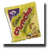
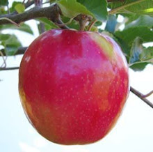
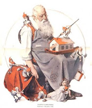
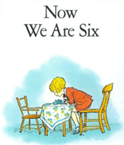
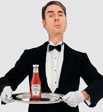
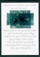
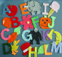
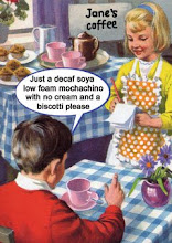
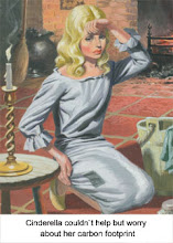
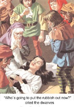
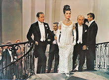
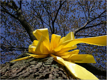
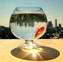
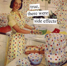
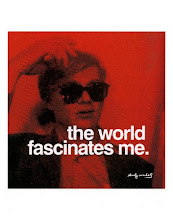
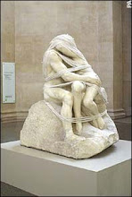
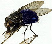
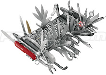
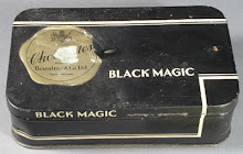
and this is what I have on the desk next to me. . .
































4 comments:
Speaking of pangolins--himself agreed if we could ever find one in need of a good home, we could keep 'im.
:-)
Oh, what are the odds of that one happenin'?!
Oh, and a few years back the agency was on a kick about 'branding'.
*shaking head*
It's not like we're selling colas or gasoline or fabric softener--geeze.....
I'm embarrassed to admit that I had to ask what the V&A was.
But I got a great tale of how terrified he was, as a wee lad, of the suits of armour with eyeballs peering out at him.
:-)
I do hope you've had a fantastic Saturday.
*HUGE hug*
there's no reason why you might know the name of one of the London art museums, really!
I only know the NYC ones cos I've been there
visiting somewhere like the V&A is so much more meaningful as an adult, anyhow - you get to spend as much time in the cafe and the gift shop as you want, without feeling that you ought to be seen to be "doing the culture"
(what does that tell you about my childhood, eh)
I'm glad Saturday is over, to be honest, but thanks for the hug
muchly
X
reading the comments is where I learn what the post was talking about....laughing.
corporate identity. yuck
you will be assimilated....
Post a Comment